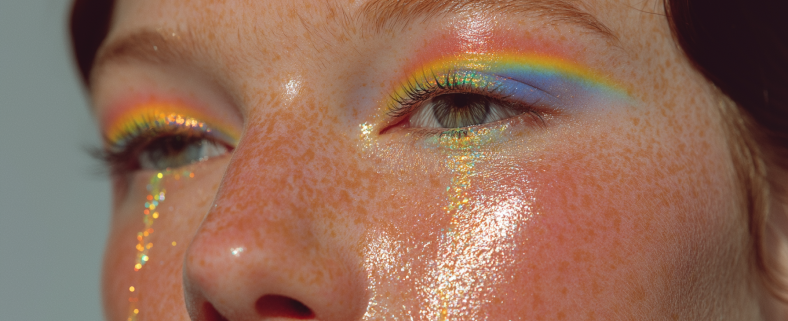
Oops, Your Blue Looks Purple in Print

It’s a classic design plot twist: colors that look stunning on screen don’t always play nicely in print. On top of that, their ultra-saturated palette, was tricky to work with. It left very little breathing room in layouts and made it hard to strike the right balance.

