Birl – Web Development, Visual Identity & UX / UI
2024 - Ongoing
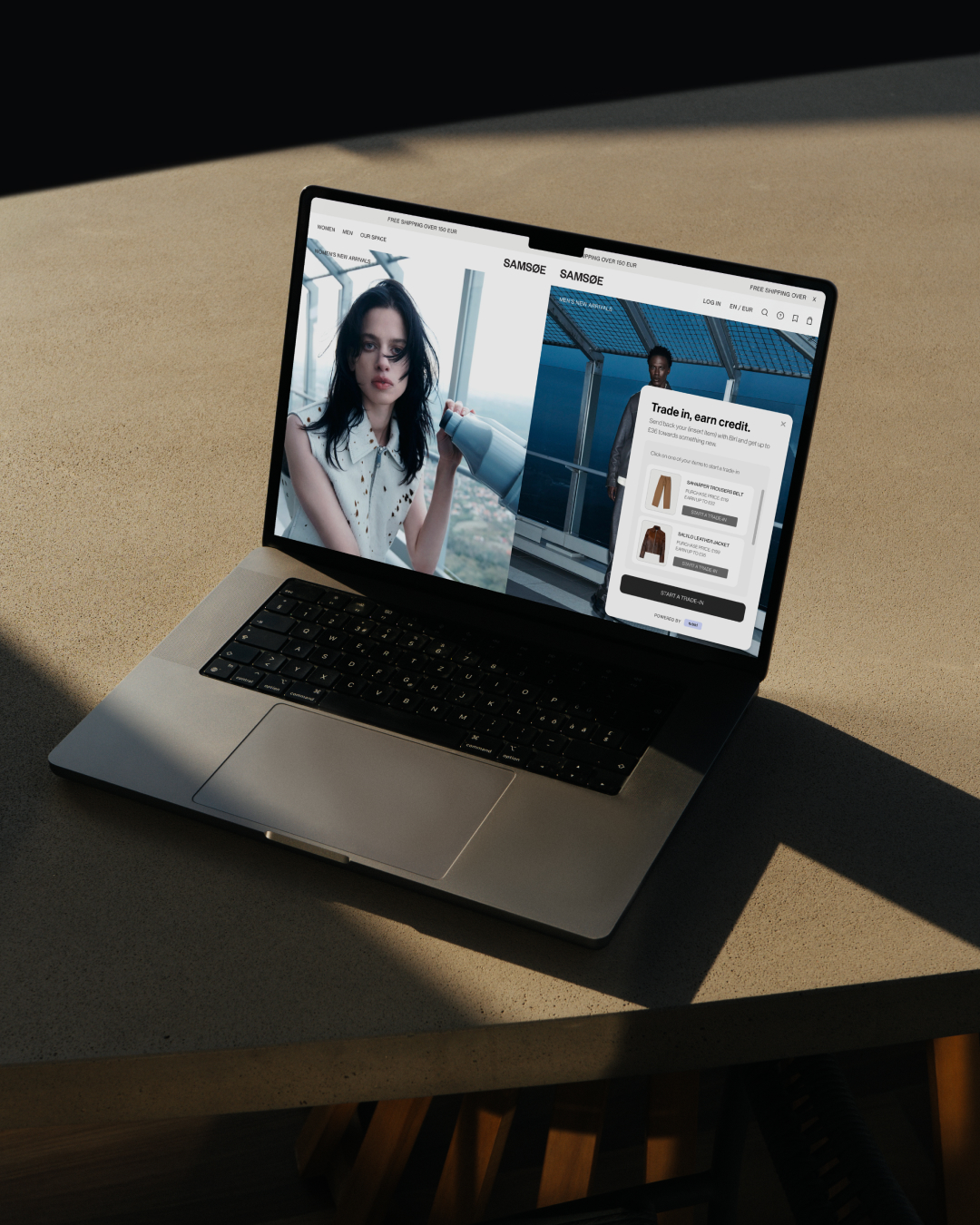
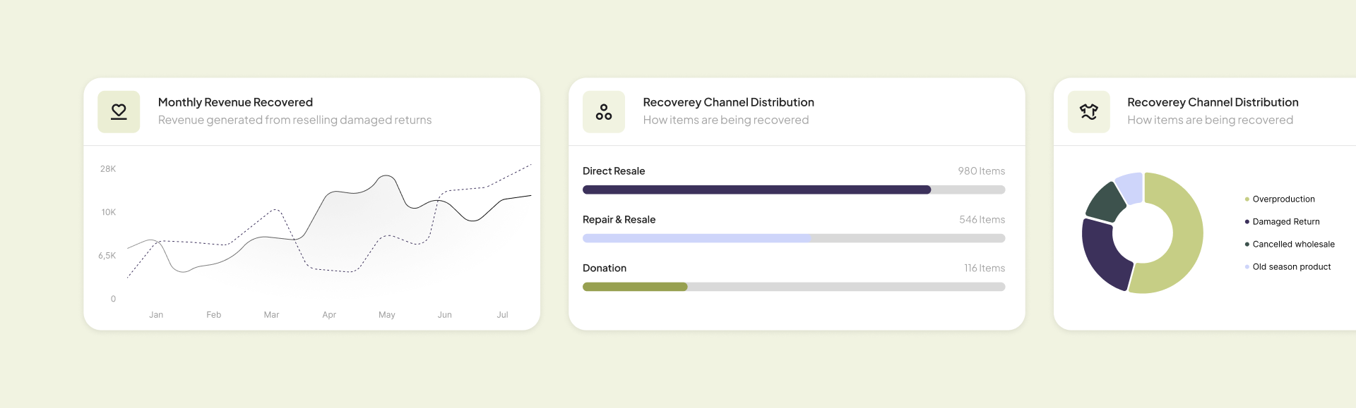
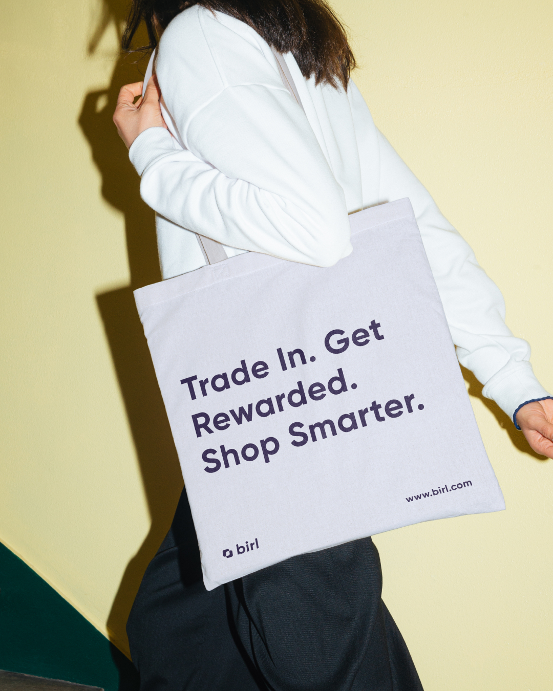
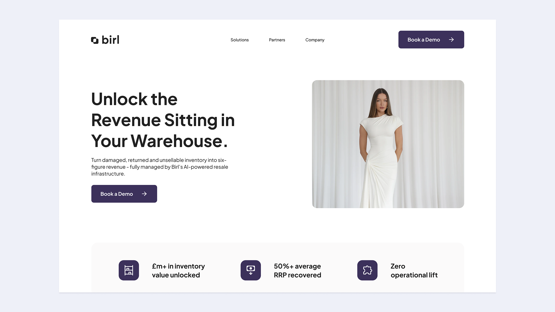
Birl was entering the Scandinavian market and needed a brand that could speak to three very different audiences at once; investors, brand partners, and end users. We rebuilt their visual identity, restructured their core trade-in UX, and redesigned their website around clearer messaging and sharper positioning.
The identity is rooted in circularity but stripped of sustainability clichés; modern, flexible, and built for commercial credibility. In October 2024, Birl secured a £500K pre-seed round; they've since onboarded 10+ sports clubs and fashion brands across the region.
The identity is rooted in circularity but stripped of sustainability clichés; modern, flexible, and built for commercial credibility. In October 2024, Birl secured a £500K pre-seed round; they've since onboarded 10+ sports clubs and fashion brands across the region.