Dot to Dot – Visual Identity & Animated Graphics
2026
Dot to Dot needed an identity that felt as considered as the creatives it represents. A talent agency lives between people, so the brand had to feel warm and personal without losing its editorial edge.
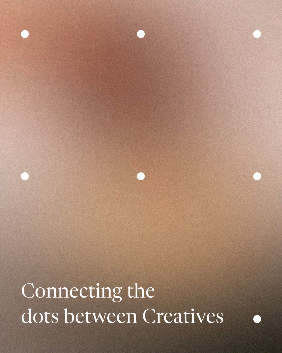
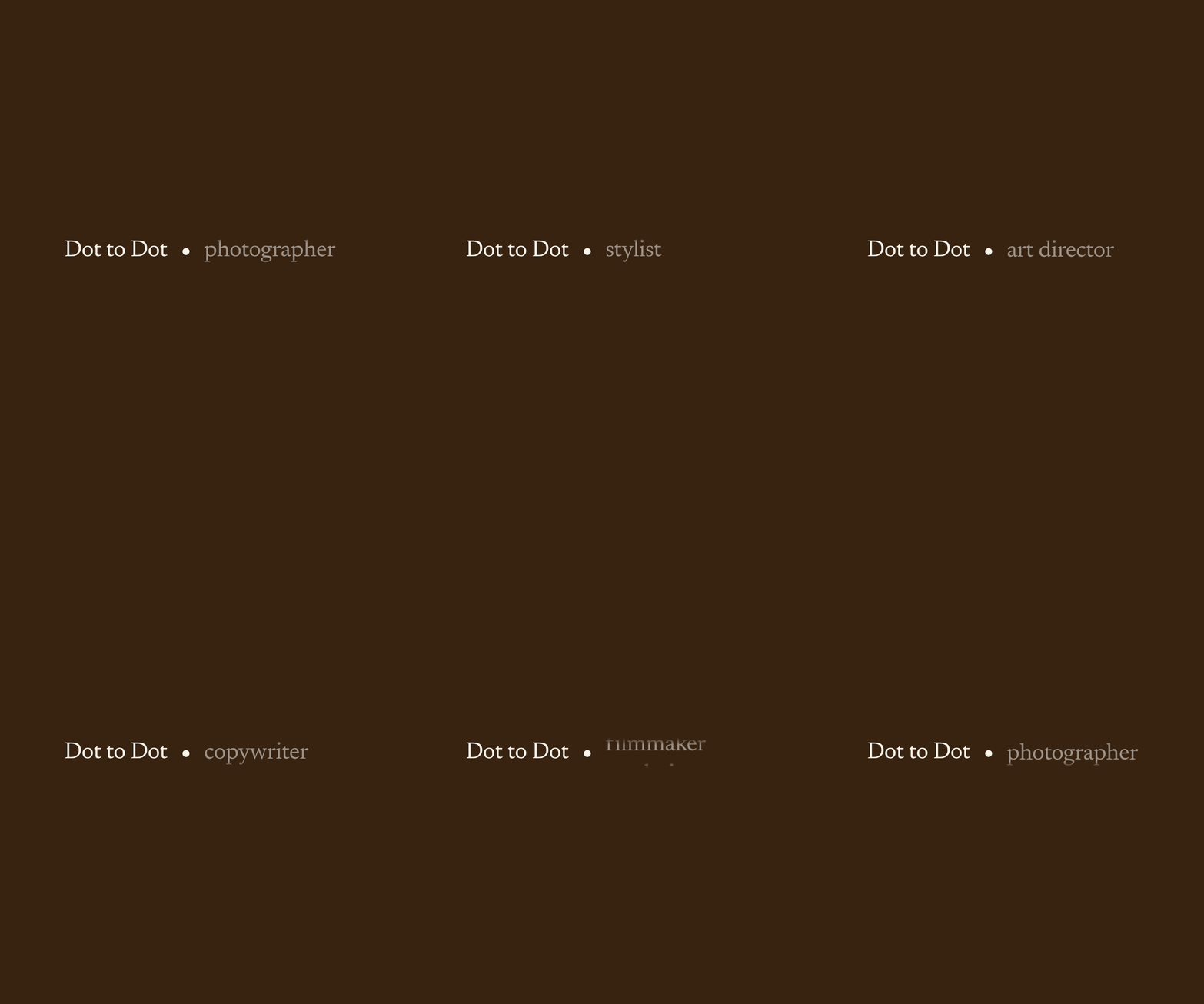
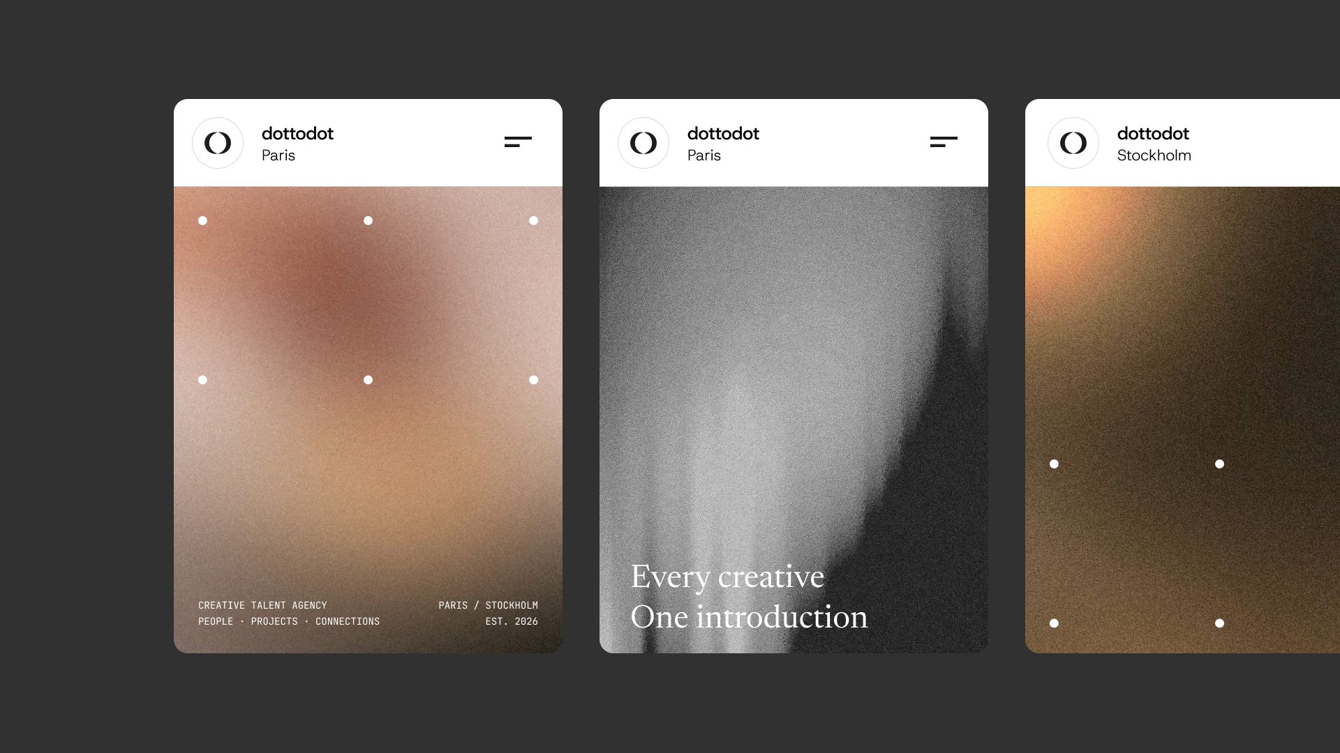
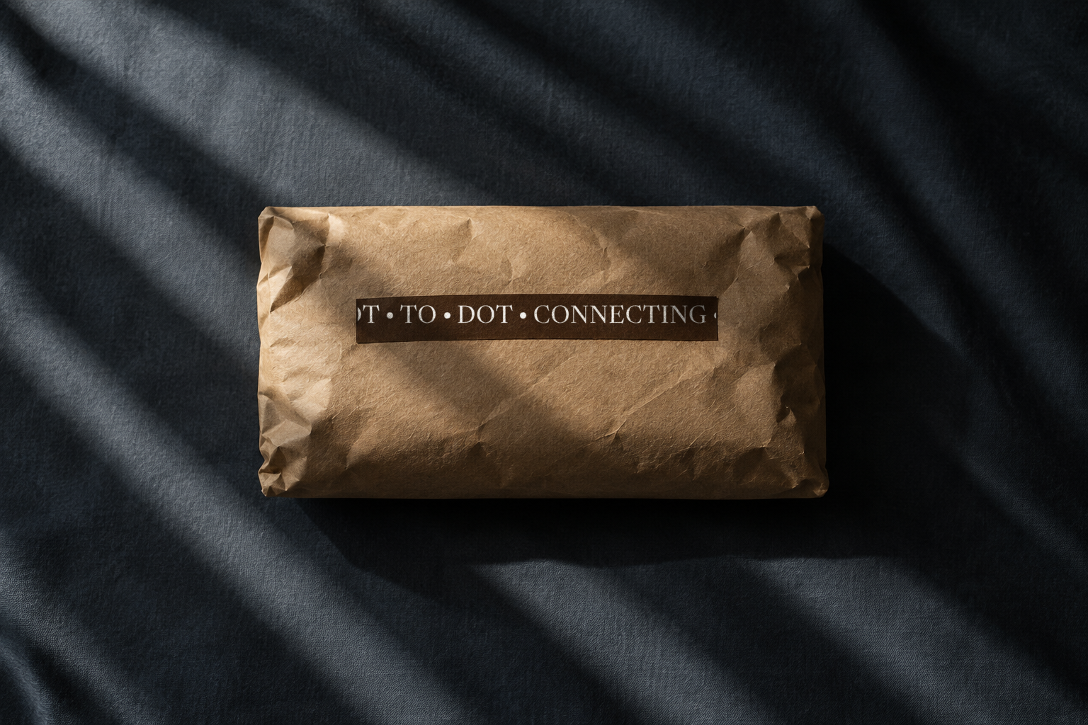
We built the system around the idea in the name: connection. A single dot separates and joins the wordmark and the disciplines it introduces, from photographer to stylist to art director. The same dot recurs across print, motion and social, quietly marking where one person meets the next.
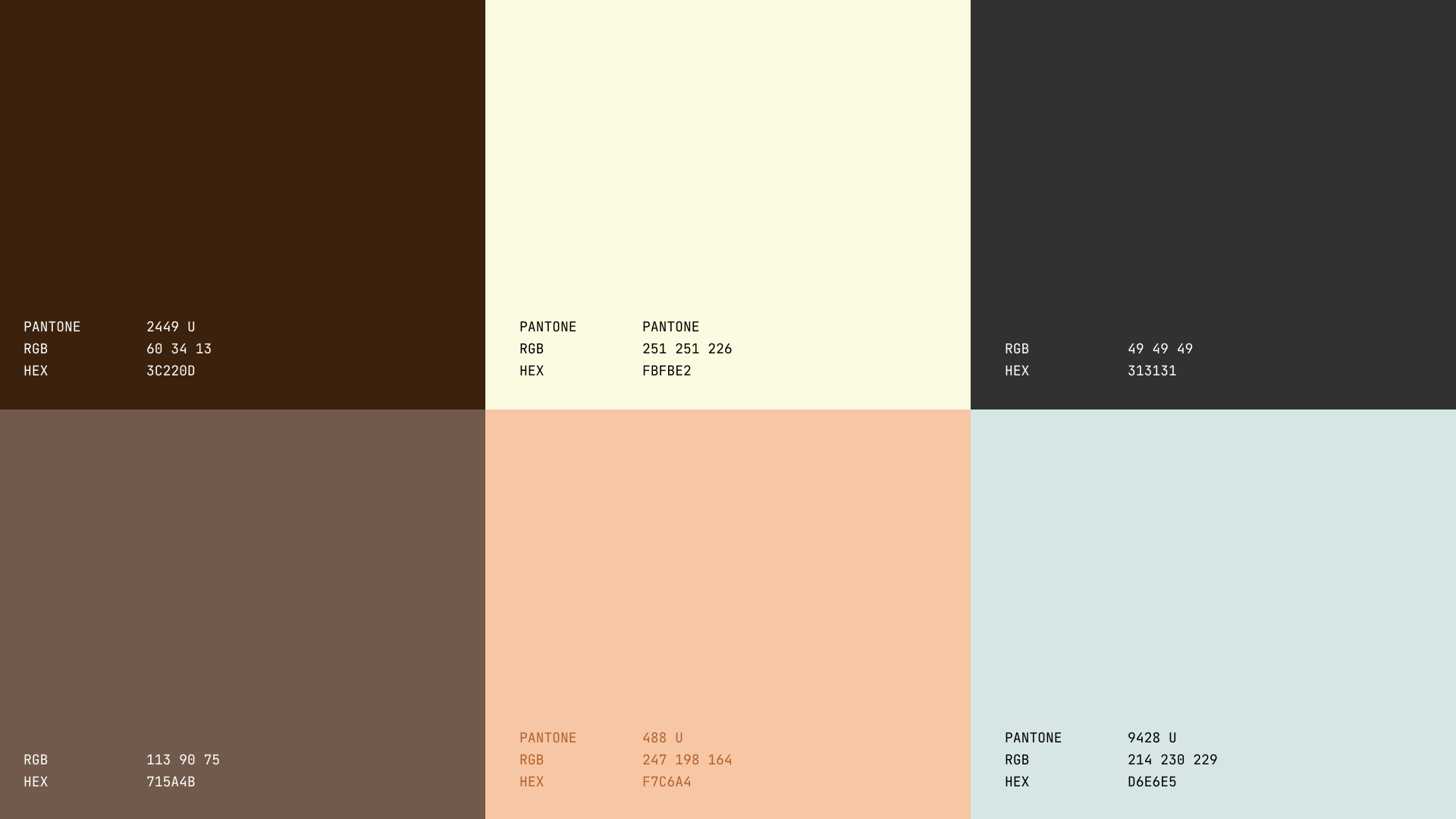
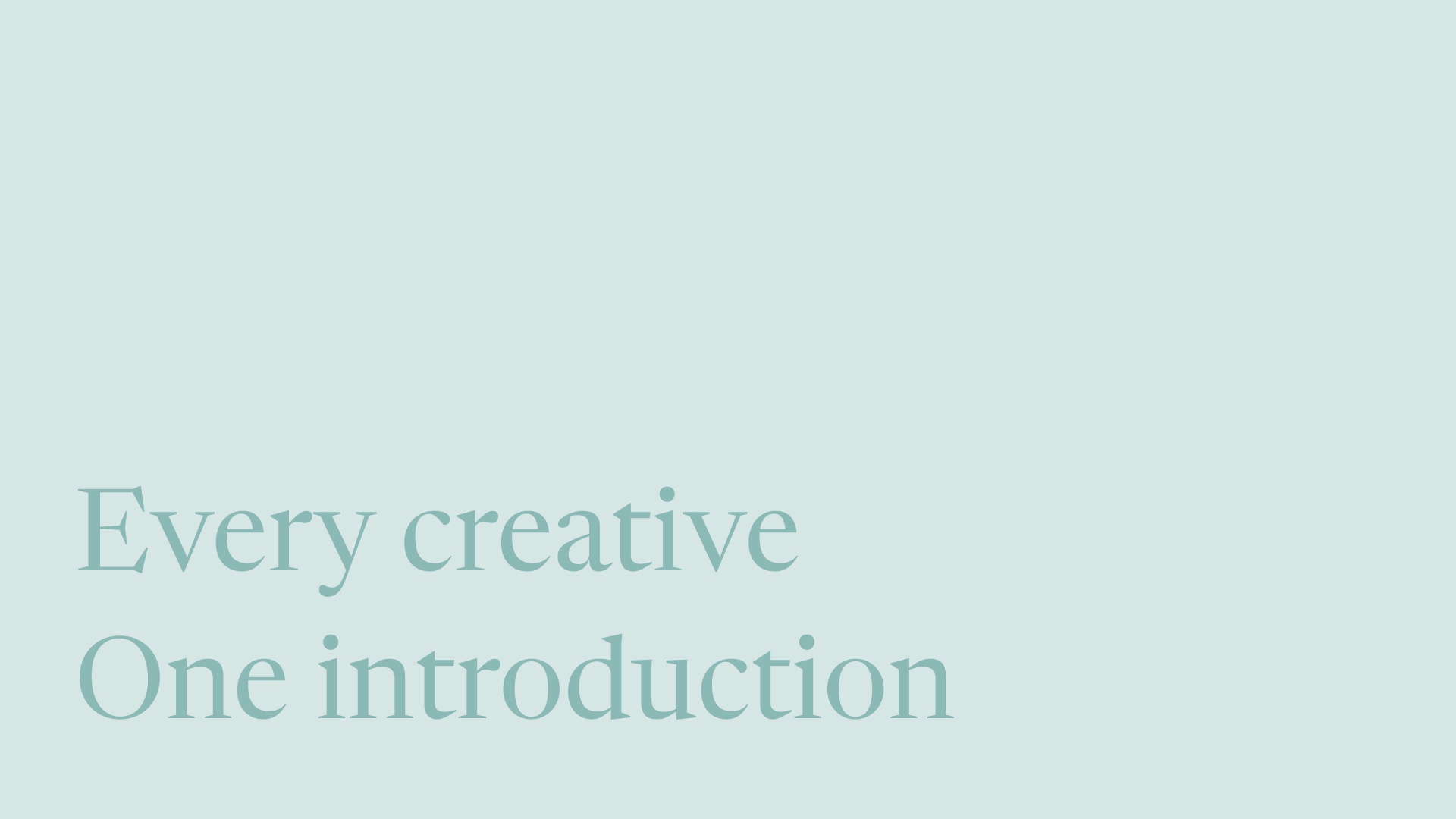
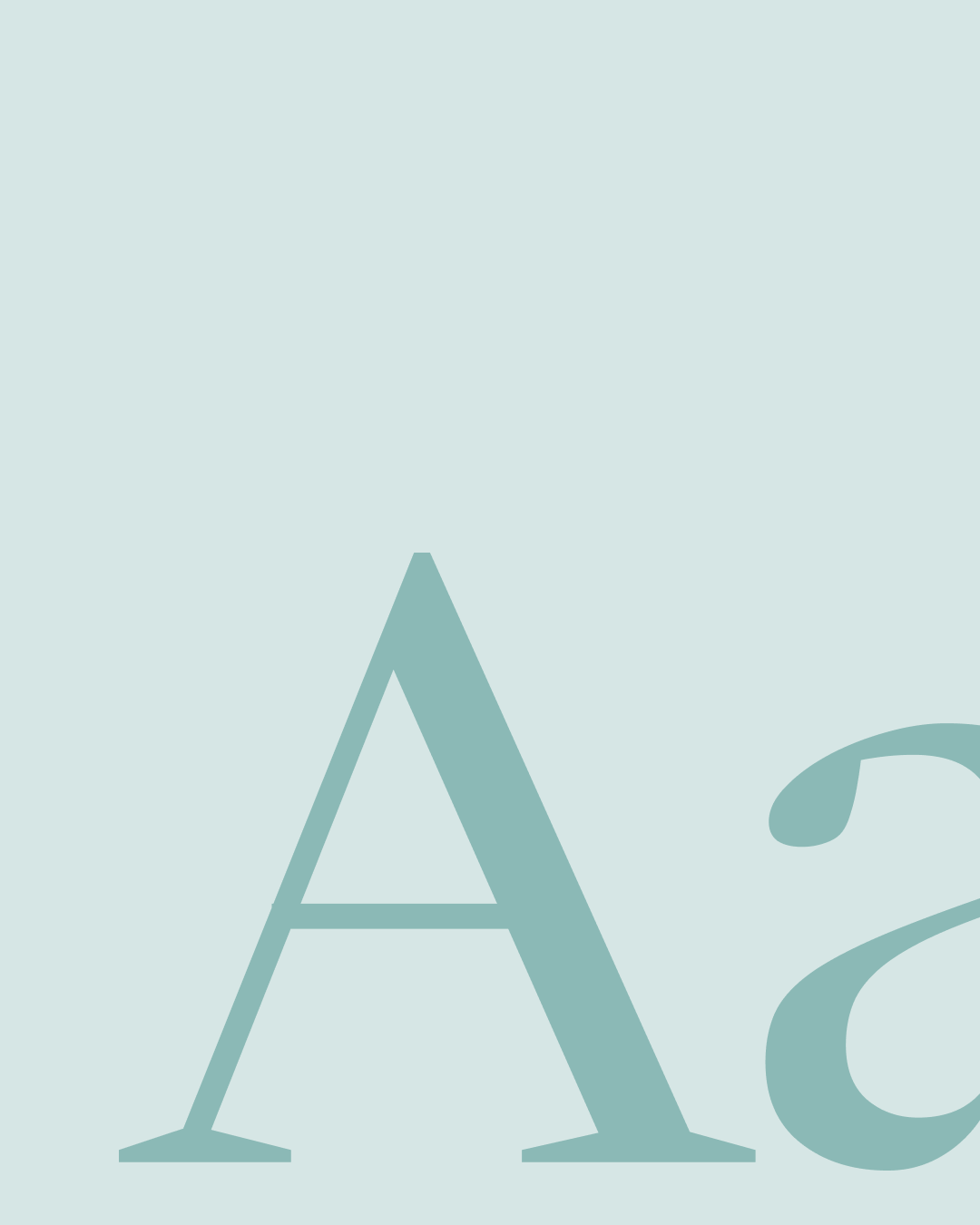
Newsreader carries the voice with an editorial, almost literary warmth, while JetBrains Mono handles the details: dates, cities, captions. Set against deep brown, warm cream and a soft sage, the result is calm, confident and unmistakably human.
We built the system around the idea in the name: connection. A single dot separates and joins the wordmark and the disciplines it introduces, from photographer to stylist to art director. The same dot recurs across print, motion and social, quietly marking where one person meets the next.
Newsreader carries the voice with an editorial, almost literary warmth, while JetBrains Mono handles the details: dates, cities, captions. Set against deep brown, warm cream and a soft sage, the result is calm, confident and unmistakably human.