Gravitas – Visual Identity
2025
Gravitas came to us with a clear ambition, to build a brand that felt bold, premium, and future-ready, without losing the approachability needed to connect with the businesses they work with.
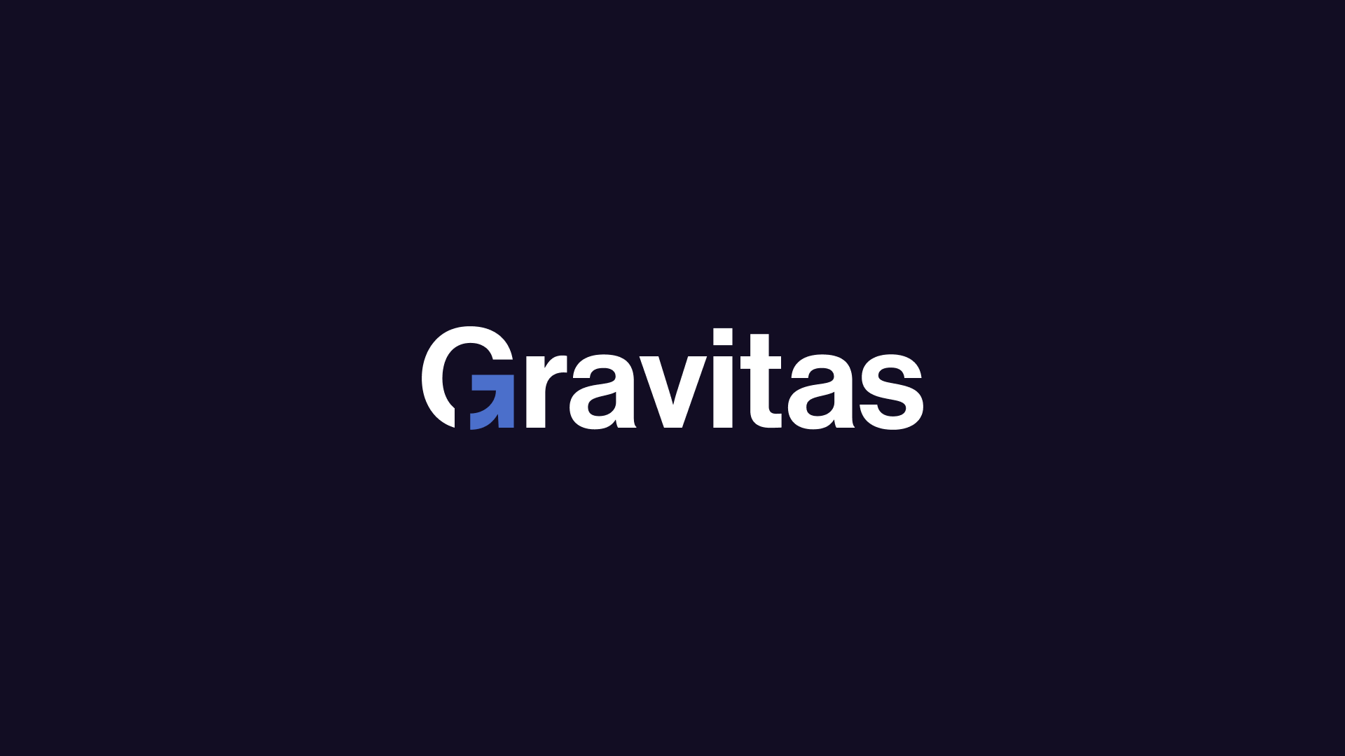
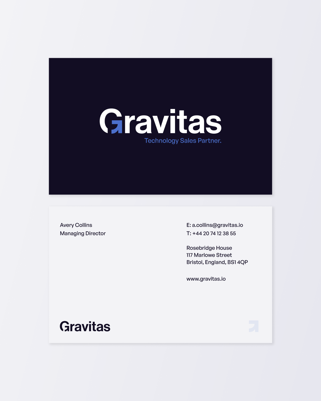
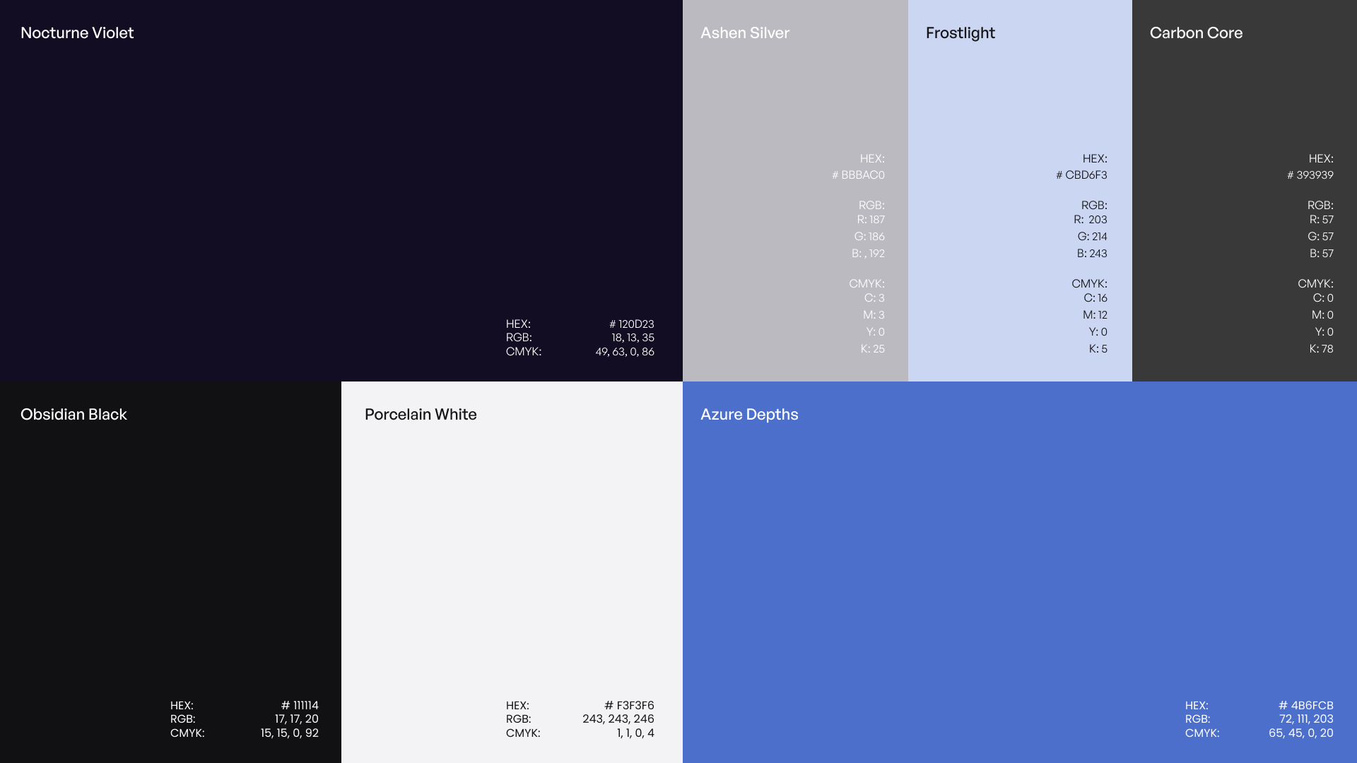
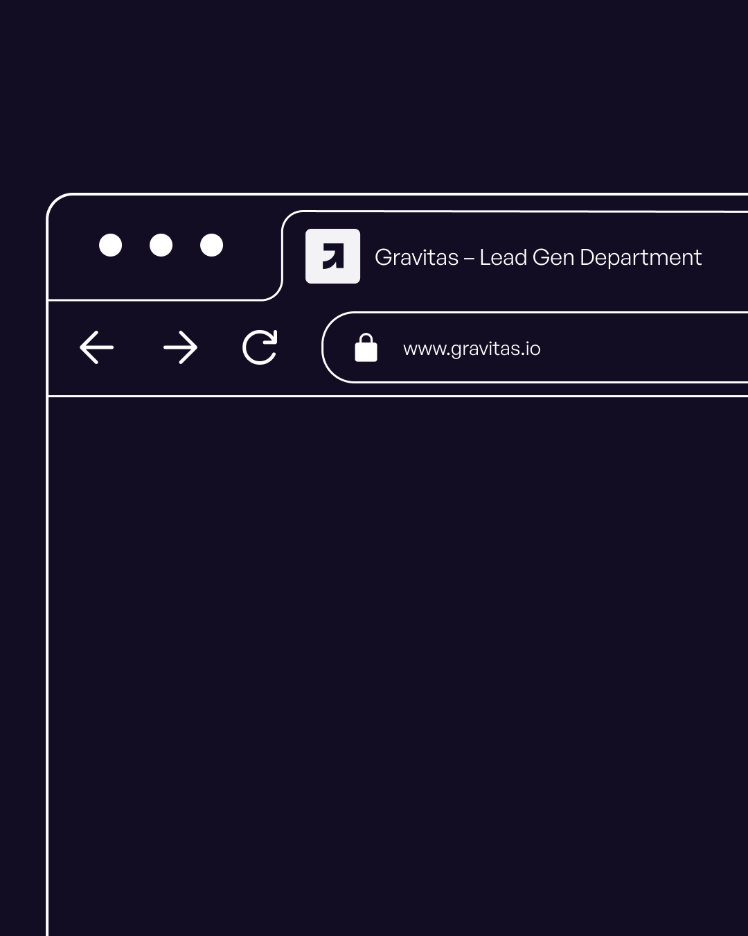
We developed a full visual identity built around confidence and maturity: a geometric logo with a hidden arrow embedded in the "G", symbolising growth and forward momentum, supported by a palette that balances muted neutrals with a strong blue accent.
Typography and spacing were treated with the same intention, generous, structured, and calm. The result is a system that feels elevated without being closed off, and built to scale alongside the company's long-term vision.