Zephra – Visual Identity
2025
Zephra came to us with a vision to reposition wind energy, not as heavy infrastructure, but as something elegant, desirable, and design-led.
The challenge was to build a brand that could speak to architects and real-estate developers on one side, and premium consumers on the other, without losing coherence.
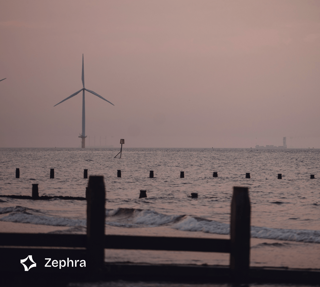
We developed a visual identity rooted in Scandinavian minimalism and kinetic energy, a geometric logo referencing wind movement, a Nordic blue and metallic palette, and an imagery direction that treats turbines as sculptural objects rather than industrial machinery. The result is a brand that makes clean energy feel like a lifestyle choice.
The challenge was to build a brand that could speak to architects and real-estate developers on one side, and premium consumers on the other, without losing coherence.
We developed a visual identity rooted in Scandinavian minimalism and kinetic energy, a geometric logo referencing wind movement, a Nordic blue and metallic palette, and an imagery direction that treats turbines as sculptural objects rather than industrial machinery. The result is a brand that makes clean energy feel like a lifestyle choice.
.png)

.png)